
The 7 Stocks Driving the S&P 500's All Time High
- Kash Chandran
- Feb 13, 2024
- 8 min read


You've probably heard this a lot already in 2024,
The 7 Biggest Stocks are Carrying the S&P 500
As an entrepreneur, I'm sure this is intentionally vague to make for a catchy headline and draw readers in.
As a quant though, this is too vague for comfort.
What does it mean to "carry" the S&P 500?
How sensitive is "carrying" to 7? What about the top 6 stocks? 8? 9?
Is this a good or bad thing?
In this post, we'll precisely answer each of these questions to understand what it means for the 7 biggest stocks to carry the S&P 500.
The Punchline
The main chart we'll need is below.
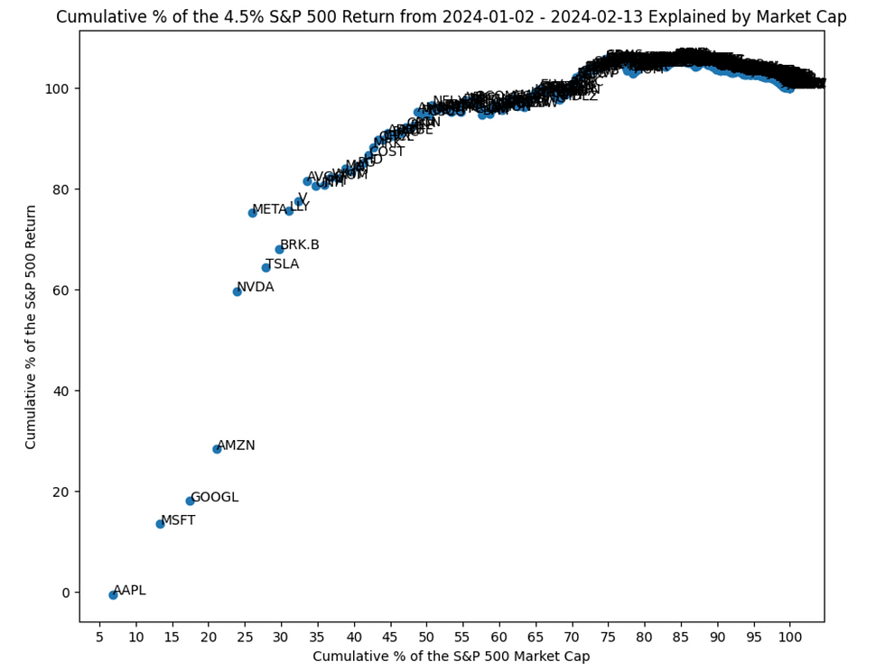
It plots, for each of the constituents of the S&P 500, sorted descending by their market capitalizations,
(y-axis) The cumulative percentage of it's contribution to the S&P 500's YTD return of 4.5%, vs
(x-axis) The cumulative percentage of its market cap in the S&P 500.
Let's do a couple of examples so we understand how to read it.
AAPL's market cap is 6.8% of the S&P 500. It's been flat (up 0%) YTD, so hasn't carried any of the S&P 500's YTD return of 4.5%. We represent it at the point (6.8,0).
Next up is MSFT. It's 6.5% of the S&P 500's total market cap, and is YTD up 9.6%. Together with AAPL, they represent 13.3% of the S&P 500's total market cap, and have carried 13.5% of the S&P 500's YTD return of 4.5%. We represent it at the point (13.3,13.5).
AAPL, MSFT 13.5% Carry = (6.8% * 0% (AAPL)+ 6.5% * 9.6% (MSFT)) / 4.5% (S&P 500)
Next is GOOGL. It's 4.1% of the S&P 500's total market cap, and is YTD up 5%. Together with AAPL and MSFT, they represent 17.4% of the S&P 500's total market cap, and have carried 18.1% of the S&P 500's YTD return of 4.5%. We represent it at the point (17.4,18.1).
AAPL, MSFT, GOOGL 18.1% Carry = (6.8% * 0% + 6.5% * 9.6% + 4.1% * 5%) / 4.5%
Let's skip to NVDA since that's where things get really interesting. It's 2.8% of the S&P 500's total market cap, and is up 49.7% YTD. Together with AAPL, MSFT, GOOGL and AMZN they represent 23.9% of the S&P 500's total market cap, and have carried 59.7% of the S&P 500's YTD return of 4.5%. We represent it at the point (23.9,59.7).
See how the NVDA point jumps ahead of AMZN?
Also notice in each example, we quantify the amount those stocks have carried the S&P 500's YTD return of 4.5% by it's (market cap weighted) fraction to the whole, which is the y-axis.
Now that we understand how to read the chart, let's answer our questions:
Question 1: What does it mean to "carry" the S&P 500?
Let's count from left to right in our first chart. The top 7 stocks in the S&P 500 are,
AAPL, MSFT, GOOGL, AMZN, NVDA, META, TSLA
Altogether, they represent 27.9% of the S&P 500's total market cap, and 64.4% of it's YTD return. That is to say,
The 7 biggest stocks represent just 28% of the S&P 500's total market cap, but 64% of it's YTD return.
Apparently, that's what the media means when they say the biggest 7 are carrying the S&P 500.
Question 2: How sensitive is "carrying" to 7? What about the top 6 stocks? 8? 9?
Again, let's look at our chart.
The top 6, 8 and 9 stocks are represented by the META, BRK.B and LLY points, respectively. Specifically:
META's (26,75) is near LLY's (31,76) on the upper end,
BRK.B's (30,68) is near TSLA's (28.64) on the bottom end
I'd say this pretty sensitive. By going from 7 to 8, we increase our market cap by 2%, but carry 4% more of the S&P?
Try going from 7 to 9: we increase our market cap by 3%, but carry 12% more !
7 to 6, we drop 2% in market cap, but gain 11% !
All-in-all, we seem to be carrying a lot more of the S&P 500 return going up or down a bit in market cap.
Things seem ok past LLY: you could almost draw a line through the remaining cloud of points - indicating these are all contributing roughly the same amount in carrying the S&P 500 return.
I'd prefer saying,
The 9 biggest companies are carrying the S&P 500: they represent just over 30% of its total market cap, but just over 75% of its YTD return.
But that's just me.
Question 3: Is this a good or bad thing?
To answer this, notice what we did in Question 2: META, LLY, BRK.B and TSLA all had similar market caps near 30%, but dispersed values in how much they carried the S&P 500 YTD return.
Remember the point where NVDA jumps?
All we're doing here is seeing how much more we carry the S&P in the y-direction as we proceed to the next point in the x-direction: in other words, how gappy the y-jumps are, the gaps themselves being the returns of that constituent. The gappier those jumps, the more important that stock is in carrying.
How gappy these constituent returns are is known as the dispersion of the index, which we measure here by using the market cap weighted standard deviation of the constituent returns.
The market cap weighted standard deviation of what now? You should be thinking histograms, and so we'd be remiss if we didn't provide one.
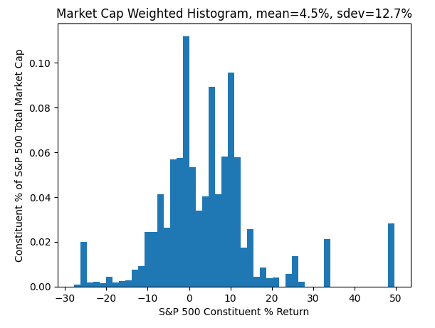
Every point contributing to this histogram is an S&P 500 constituent. It's return is on the x-axis, and it's % of S&P 500 total market cap is on the y-axis.
See that point all the way to the right at 50? Yep - NVDA. Also see how big of an outlier that is? Yep - it's that point on the first chart where NVDA jumps.
In fact - the first chart was generated from this one, we just "integrated" out each axis to stretch it out so you could see each constituent and their gaps clearly.
Notice a fundamental connection here: the average value of this histogram is 4.5% which is exactly the S&P 500 YTD return. No surprise then that its standard deviation should capture its dispersion of 12.7%, or the spread of the constituent returns.
There are some quirks regarding rebalances, divisors and corporate actions that affect this connection - but it's pretty accurate at short time scales, and is always a measure of understanding the market even if it departs from its link with the S&P 500.
You can check out the last section for what these quirks are exactly and a proof of the connection itself.
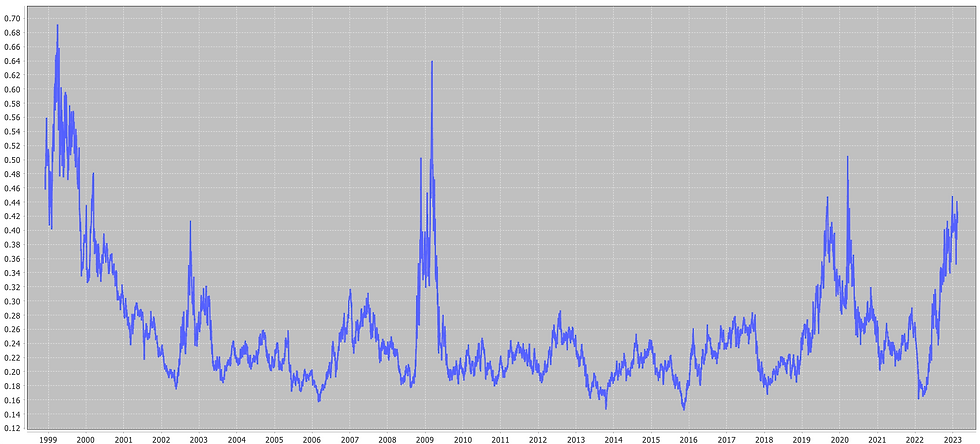
To find out if this is good or bad, we have to compare the 12.7% dispersion to historical values.
We do this below - plotting the dispersion on a 30 business day rolling basis.
So is this good or bad?
Recent values are near pandemic peaks, but not as near the dot-com bust of the 2000s or the 2008 financial crisis. This signifies disparity in performance on a market cap basis where few are departing from the pack. A healthy market would see constituents performing at comparable rates, which would reduce dispersion.
The sensitivity we noticed in Question 2 also backs this up. We seem to be carrying much more of the S&P 500 for small gains in market cap, the gappiness of which is summarized by a 12.7% dispersion value.
Bad.

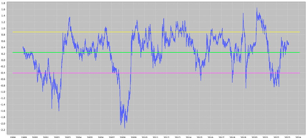
On the other hand, let's plot the z-score, or the return divided by its dispersion, over time. We've added the average, upper and lower error bars on this chart to gauge typical values.

This is an indicator of dispersion relative to gains. If we have a positive return and the constituent returns marching "tightly" together we'll see large positive values. Similarly for negative returns.
On this basis recent dispersion relative to gains isn't bad, but certainly could be better. The few stocks that have done well are enough to justify the laggards, resulting in low z-score of 0.5.
I'd prefer to see a value above 0.7, so that we hold onto our gains, but have it due to more stocks tightly supporting it.
Conclusions
The next time you hear something like,
The 7 Biggest Stocks are Carrying the S&P 500
You should be asking yourself three things:
What does it mean to "carry" the S&P 500?
How sensitive is "carrying" to 7? What about the top 6 stocks? 8? 9?
Is this a good or bad thing?
In this case, in 2024 as of Feb 13,
The 7 biggest stocks represent just 28% of the S&P 500's total market cap, but 64% of it's YTD return.
The statements change a lot seeing as 6, 7, 8 and 9 are all around 30% of total S&P 500 market cap, but we end up carrying 75% to 64% to 68% to 76% of the S&P 500 YTD return, respectively.
The current S&P 500 dispersion is historically high, signaling disparate performance of a few from the rest. The few stocks that have done well are enough to justify the laggards - but it would be better if more constituents supported the gains vs having concentration risk in 6 - 9.
You've also learned how to justify all this quantitatively using really cool charts. Great to whip out at parties.
Longer than 30 Days?
You might be tempted to do this for longer than the 30 business days we did here - but be careful when interpreting the results, as 3 conditions need to be satisfied in order for us to interpret the results correctly and match them up to the S&P 500.
When the time range is small enough - they're easily satisfied, or approximately so that the results remain valid. When the timescale becomes too long though...caveat emptor.
You can continue to the last section to learn more about what these conditions are and why our choice of the dispersion measure captures clustering of the constituent returns. Nevertheless, we provide both plots for the dispersion and z-scores over time, respectively, below, for yearly returns:
On this basis, the dispersion is clearly as high now as it was during pandemic peaks (bad), followed by the 2008 financial crisis and the dot-com bust.
On a z-score basis things don't seem too as bad - but the S&P 500 is at all time highs, so it can tolerate a larger dispersion and still have a z-score of around 0.5.
Learn more about indices, ETFs and stat arb. Sign up to start quant trading today.
Want more?
Learn how Roth IRAs and Mega Backdoor Roth IRAs could generate millions tax-free in your post-tax retirement strategies !
Estimate how much you could have in retirement using Pre-Tax Strategies that could reduce your taxes now and nab you millions at retirement.
Subscribe to our Substack page to read and keep up-to-date on upcoming strategies.
Dispersion Capturing Clustering
We mentioned in the last few sections that using the market cap weighted standard deviation of the constituent returns is an effective measure of clustering of points along the y-axis.
To see why this is true, we need to understand a bit more about how the S&P 500 is computed.

where Divisor is a proprietary value that changes with the corporate actions of the constituents.
Let's compute the Index Level returns between two points in time,

Next, we'll make the following 3 assumptions, which are satisfied for times t and t+1 that are close:
Rebalances don't occur. This means the same 500 stocks exist at times t and t+1,
The Divisors are the same at times t and t+1,
The free float shares are the same at times t and t+1.
With this in hand, the index level returns become,
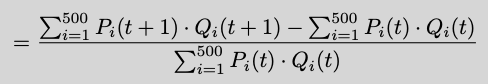
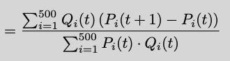
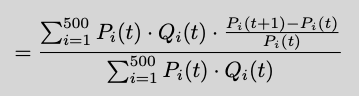
which is a weighted average. A weighted average of the individual stock returns to be exact, with the weights given by their market caps at time t. Notice where each of the 3 assumptions were used.
If the S&P 500 returns over short enough time periods can be represented by a market cap weighted average of the constituent returns, then its weighted standard deviation works as a way to measure how dispersed or clustered these returns are relative to their market caps. This is exactly the gappiness we saw in the first section in the cumulative returns along the y-axis.
Note you can always use this market cap weighted average - it might just not line up with the S&P 500 returns due to the errors committed by violating the three above conditions. But, it's a perfectly valid index return, with a perfectly valid measure of dispersion - perhaps more so because it isn't as sensitive to corporate actions, proprietary adjustments and so on.
Want more market insights? Sign up to start quant trading today.

Comments